Delphine and Mick came to us with a shared ambition: to build a full-service interior studio that offers complete peace of mind, handling everything from the initial mood board to putting the cups in the cupboard. They had already come up with the name themselves (Delphine + Mick + Maison, a nod to the idea of a "half-house" that we turn into a complete home). What was missing was the brand identity to support that vision.
The brief was clear: develop something that feels luxurious, yet remains affordable. It’s a difficult balance to strike in a sector where "luxury" usually implies "inaccessible" and "affordable" often looks "cheap."
The name was set, and the rest was ours to build. We developed the entire brand identity: mission, values, positioning, and tone of voice, topped off with a brand promise that wasn't about placing furniture, but about furnishing someone's world. This framing became the anchor for every piece of copy, every visual, and every touchpoint, immediately giving DemiMaison a position that other interior studios don't claim: not just a supplier of interiors, but an architect of how you live in your space.
From that core, the brand materials were rolled out one by one: business cards, email banners, flyers, postcards, T-shirts, clothing pins, and the van wrap that turns their vehicle into a mobile business card. Everything was bundled into a comprehensive brand guide so the internal team can manage the brand independently, even as new team members join or the service offering expands.
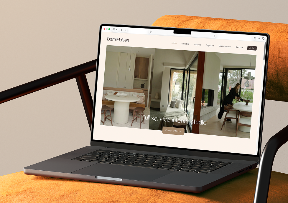
The website serves as the final piece of the puzzle. It is a single digital experience that breathes the same sense of calm as the interiors DemiMaison delivers, built for a hybrid audience of private individuals and businesses. The lease-to-own module makes the financing model immediately understandable and lowers the barrier for clients hesitant about a large upfront investment, making the offering accessible without the brand losing its luxurious character.


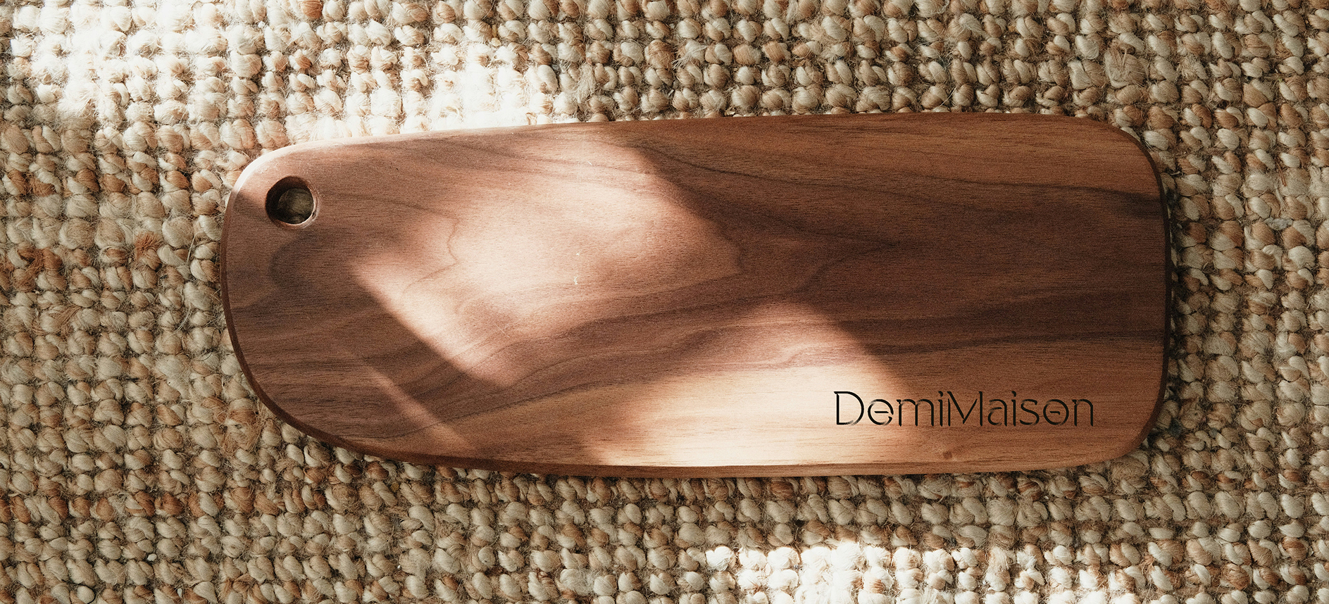
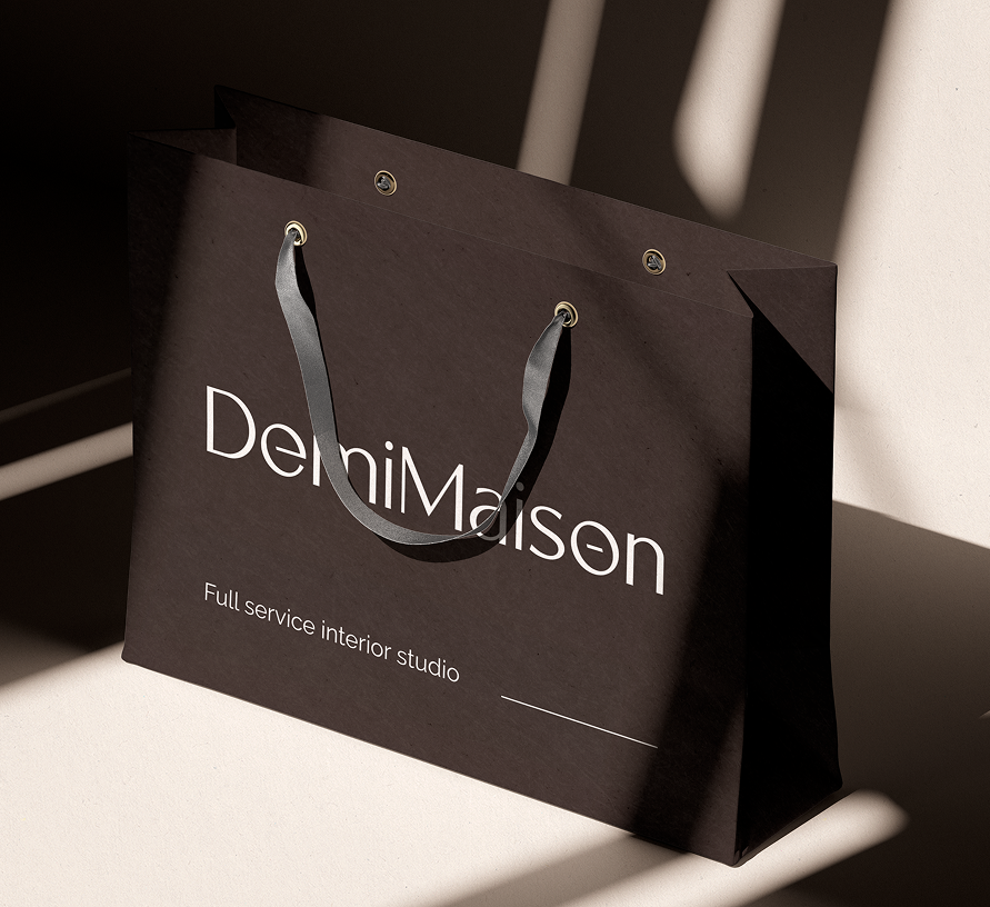
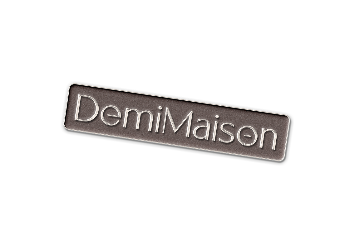
The logo plays with the name itself. The 'o' in Maison is cut in half—a literal visualization of "demi" (half) being transformed into something complete. It’s a subtle detail that captures the essence of the brand: from a half-house to a whole home. Once you see the nod, you don't forget it, which is exactly what a brand in a saturated sector needs to stay memorable.
The color palette leans fully into a wabi-sabi aesthetic. Deep brown as an anchor, cream for breathing room, and mocha as a mid-tone. Earthy, warm, and possessing the same tranquility that the interiors themselves exude—colors that feel like coming home. The typography combines a sophisticated headline font with a highly readable body font. It is modern and timeless, with enough restraint to let the interiors themselves take center stage. The overall effect positions DemiMaison in the high-end of the market without losing the accessibility the brand needs to convey.
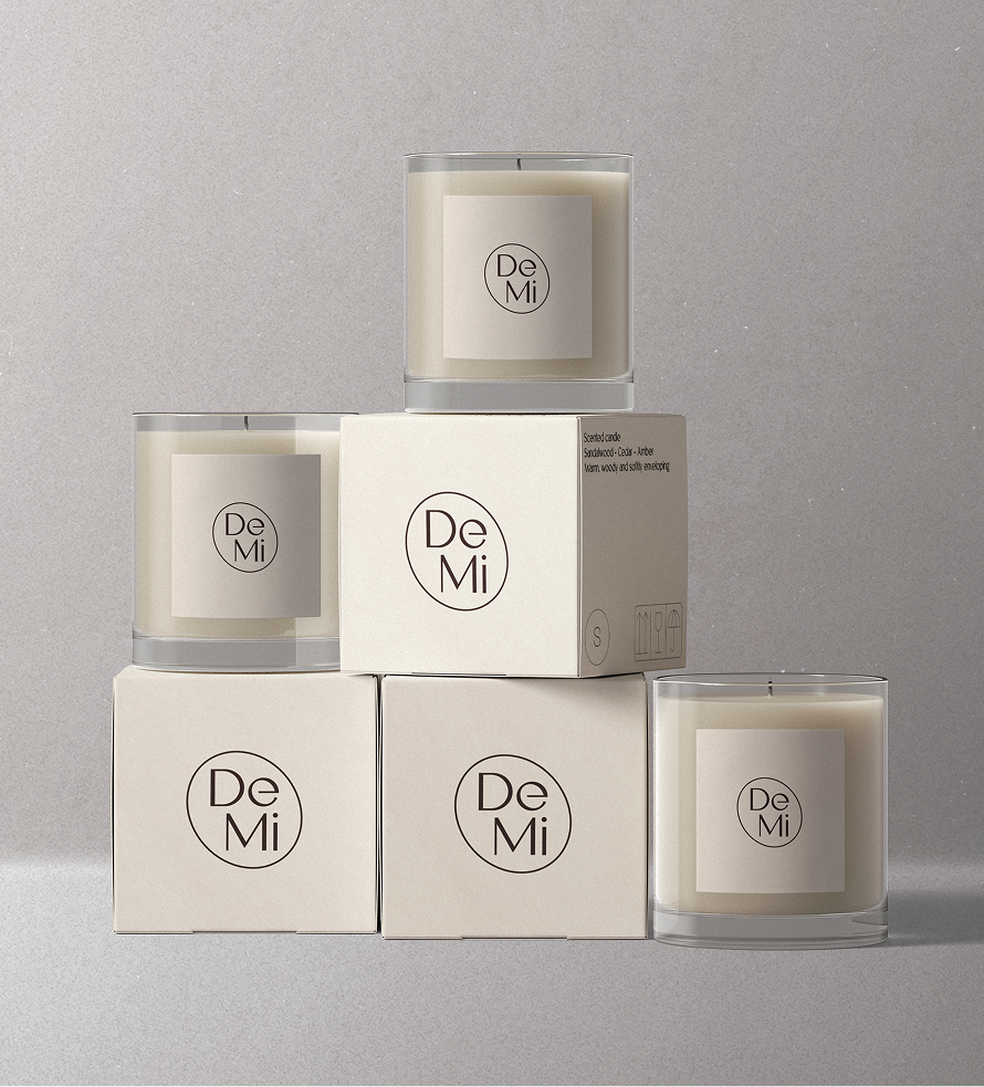
DemiMaison is live with a brand that does what a good interior does: it stands out because it just works.
From business cards to van wraps to the website: everything breathes the same story because everything was built from the same core. Delphine and Mick left Remes with a foundation that positions them as a premium player in a market where they might otherwise have been overlooked, and with a digital infrastructure that serves both B2C and B2B clients in the same journey without the brand having to choose.


.svg)


branding%20header.png)
branding%20icon.svg)


.png)