Jenley Events came to us with an acquired business, thirty bouncy castles and a vision that no longer matched the name above the door. The ambition was clear: a brand that belongs in the world of children, with room to grow into schools and businesses, and a character strong enough to survive the next few years. What they needed was effectively a complete reinvention. A name that sticks, a mascot that speaks to both children and parents, and a digital infrastructure that can carry their growth ambition.
We built the foundation from zero. A new name (Bonkidoo), a tagline that sells on first read (Bouncy castles with a smile guarantee), and a positioning that brings fun and reliability together in one brand. That's where the strategic key sat: parents buy safety, children buy adventure, and this sector rarely builds something that can carry both at once.
The centrepiece of the project is Kiko, a blue squirrel we designed from zero, including full 3D character design. A whistle around his neck (safety), a backpack full of solutions (squirrel mentality) and confetti that sticks to his tail (party). Kiko tells the safety briefing to parents, and shows up in his own Funbriefing booklet full of games for the kids on the bouncy castle itself. One character, two audiences.
The commercial heart of the project was the website, because the growth ambition rises or falls with a digital experience that feels as on-brand as the physical delivery. Our tool analysis brought out Booqable as the best match for the booking flow, purpose-built for rental, and visually embeddable into the website in a way that never gives the client the feeling of clicking away from the brand.
Final piece: launching the brand as marketing partner, so the new brand was visible from day one and the website also started delivering commercially.

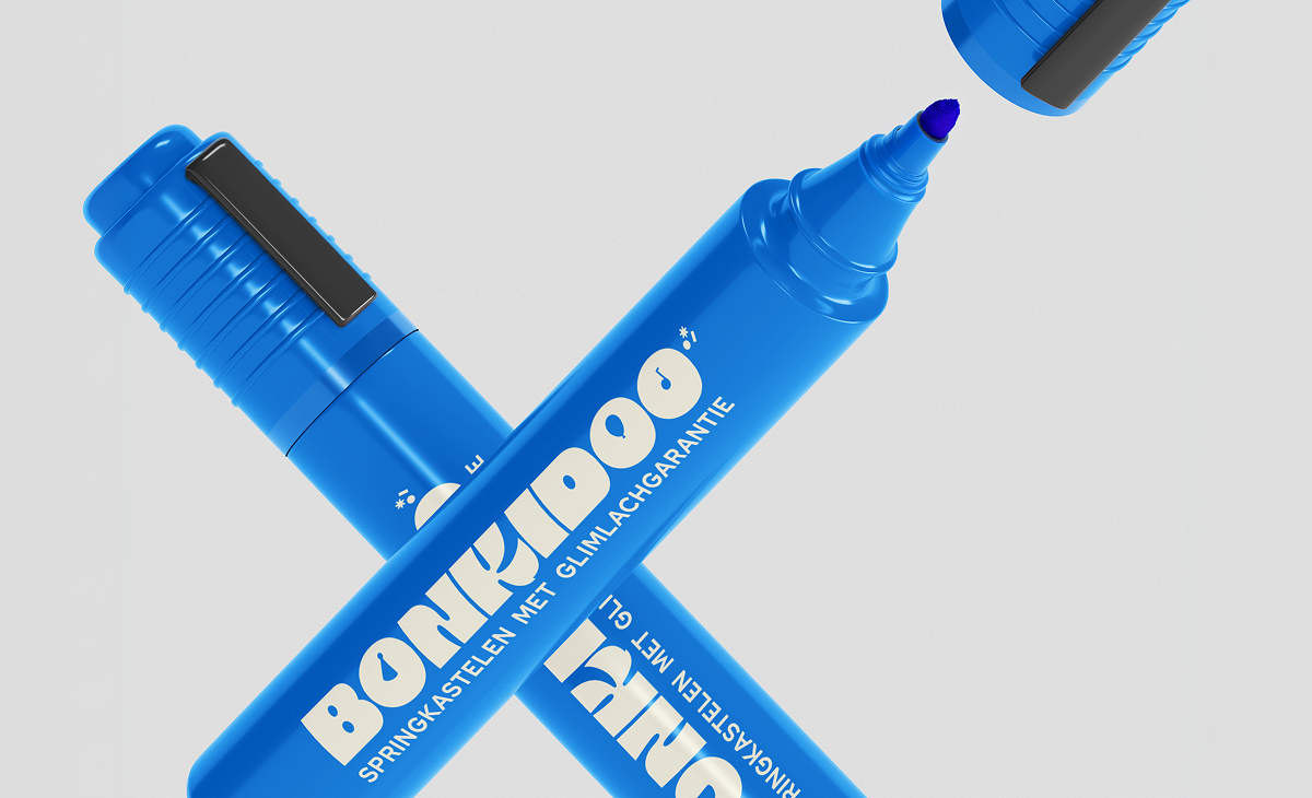
The Bonkidoo logo is a fully typographic wordmark in which every letter plays a role. The K hides Kiko's bushy tail, the rounded letterforms carry the bounce effect the brand is built on, and party elements sit hidden in the details: a party hat on the N, a balloon, a music note, a streamer. Fun, but with intention. The colour palette builds on contrast. The deep blue gives the brand an unexpectedly grown-up foundation, the kind of trust parents and event planners look for in a supplier they're entrusting children to. The fresh green nods to outdoor life, back gardens, summer Sundays. Together they capture Bonkidoo's double promise: reliable for the adult who books, playful for the child who jumps on it.


Bonkidoo is live and delivers what it promised. The website carries the bookings, the Booqable integration makes the reservation flow frictionless, and Kiko is starting to settle in as the face both children and parents come home to.
In a sector where most competitors lean on dated branding, little storytelling and websites that haven't been updated in years, Bonkidoo stands out the moment you put it next to the rest.
Three friends started with an acquired business and left Remes with a brand ready to scale, a name that sticks, a mascot that grows with it, and a digital platform that can carry the growth.


.svg)
branding%20header.png)
branding%20icon.svg)


.png)